Tuesday, 24 January 2012

Compositing for the first time


Compositing

I never thought that I would experiment with it when I first started using a DSLR. Never. Ever.

So here I was yesterday sitting down in the sticky, hot house (because all the windows were closed -- because it was raining horizontally, as it always does in Caboolture)  looking for inspiration around the house.

Hello and behold said flash of inspiration! A shot of 3 people crowded around an opening chest, complete with cliche' gold glow.

Then came the inevitable problem: looking around its me, myself and I. With no assistant, or friends who were immediately free. Sucks when everyone except yourself  works in normal Monday to Friday jobs.

Enter second flash of said inspiration.

I thought what if I used me, myself and I for the shot? Thus dawns on me the concept that I would be attempting to composite in brrr.... Photoshop.


Now my view of Photoshop has changed recently.Its a powerful tool, but, then again so is Eddie Maguire...

It's changed because it can aid the artistic expression of a photo, but nonetheless can really screw up some otherwise possibly good photo - And make kids look REALLY CREEPY.

Anyway, Returning from my tangent...

So here is the light setup I used:

Lens was my 14-24mm, zoomed out to 24mm and aperture @ f/8. I used the gold reflective cardboard to warm the reflected light. White balance is tungsten, with all lights (except for the softlighter II)  CTO'd as I wanted a slight cold feel around the edges, but warm light for the subject. I also wanted the wall to show some of the reflected warm light from the chest.

Here are the 3 separate photos used:


I liked the falloff around the edges of the couch.

Piccies were taken using timer set to 10 secs on tripod, which was a bit frustrating as improving and changing the shot took much longer then usual.

All 3 pics plus background were thrown in photoshop and blended together to get what you saw at the top. A couple of things to note here:

1. The clock shows a different time in each picture, which may have complicated things if I accidently had shadows cast on it.

2. The two pics where I am located in the middle and at the right of the couch conflict. Unknown to me at the time I pulled my elbow back when the picture of me opening the chest was taken, which conflicts the position of where I have my elbow when I wear the red shirt. I tried to place myself so that I wouldn't overlap myself but unfortunately I couldn't pick it up at the time of reviewing it on the lcd. This will be something that I will be more mindful of next time.

Let me know what you think.

Cheers,

Az.

Tuesday, 10 January 2012

5 minute Profile pic

5 minutes quite literally.

Yesterday I did a quick 2 light setup. I wanted to play more with my lumiquest softbox 3 but unfortunately at the time I just finished a meeting with alphapharm reps and I had to quickly wash the dishes before the wife came home so I tried for a quick setup. (Oh yeah I got a new job as the pharmacist in charge at a new pharmacy. Also while I'm at it - Happy new year readers!)

And here is the setup shot:


Now setting up a self composed, self profile picture can take a bit more time to set up (as you are going back and forth between camera and your position.  Normally I have my lovely wife to stand in for me so that I can have it all ready pretty quickly. Unfortunately at this time I had me, myself and I to help. I had the softbox aimed not at me but in front of me. The awesome thing about it is that it has a very defined throw of light - so I wanted to play with the edge of it. This way I wouldn't be putting much light on the background.


Once I had this light where I wanted, I wanted to use a grid on camera left to show the body of the guitar more. Getting it right was an experience, as I had to remember exactly where I had placed the guitar in relation to the grid. Once I had it roughly right I set up an interval timer and went for it.


Once I got the shot that I wanted - literally within 5 minutes (again.... dishes needed to be done) - I imported them (washed the dishes while that happened) then realised I left the ISO at 2500 on the camera. Super amateur mistake for the win. Thankfully the d700 is a bit more forgiving with higher ISOs then previous cameras. Later at night I pulled them into lightroom and used a brush to black out the bottom of the curtains, stool and my feet to get the last image that you see. 


Conclusion: Look at your camera settings more - especially if you are in a hurry.

Az.

Going for the money shot

Last night I decided to play around with my homemade grid spots.

I had trouble looking for something small that was of interest to shoot inside the house. After 30 minutes or so of shooting  I pulled out the old coin and note collection, located in the deep recesses of my closet.

I felt that the texture of the notes needed to be shown in order to convey how much it had been used previously.

Unfortunately when I was setting this up I discovered that my cheap economically priced Honkese radio triggers (that I had bought on eBay) had broken, rendering them utterly useless.

(Enter cheap optical slaves)

Set up shot


SB600 and SB700 in gridspots - optical slaves attached


My work around for this situation was to face the slaves upwards towards the ceiling and attach my SB900 to the camera and bounce it off the ceiling, so that the slaves would fire off (@ 1/128th power so that the light from it doesn't contaminate the image). To illustrate this I have really badly drawn diagram in MS paint READ: I can't draw to save my life - hence why I like photography as an artform.


So then I take a few test shots to start getting an idea how the notes look. I placed the two speedlights where they were so that I could create little shadows, to show the texture of the surface.

So I took a few test shots of some old Japanese occupation currency first:


The I tried to rotate the grids to have that real "shedding light on a secret" kind of thing


Then just add coins


I might consider taking more of my collection soon, given the results :)

Ta ta for now,

Az.

Tuesday, 29 November 2011

The Gateway......s

Hey hey again,

This time took a little stroll under the bridge for some straight up long exposure shots. It had been awhile since I last shot the bridge, as the second bridge was still being constructed at the time.


So a quick post tonight. I promise more soon and hopefully with more descriptions, setups etc.

Cheers,

Az.

Thursday, 3 November 2011

Comics and you


Now I'm not a big Photoshop person when it comes to photos - I'm very much of a "If its not good in the can, then its not good at all" type of guy. That also being said if it's altering contrast/brightness/saturation etc. then go ahead

BUT...

Photoshop is a VERY powerful tool (So is Eddie McGuire ;P) and I'm starting to learn it so that I can do some "arty" type stuff with my photos. One thing that I have started to do is attempt some Silver/Gold Age Comic style pieces (As I suck at ALL forms of art).

My first Attempt was with 2 shots of my TKD instructors:


Now what I did was take the originals, cut out the people and added a thick stroke around. I drew a bit from some manga (READ: DBZ) where action scenes have either a starburst or diagonal lines in the background.

Later I thought that I could improve on the design by using a Film grain and Colour Halftone filter to make the photo appear more "comicky"

So I used a previous photo that was posted here to test it:


Another thing that I did was add a thick black border and put a bit of a gradient in the Text box to recreate the colour inconsistencies that earlier comics had.

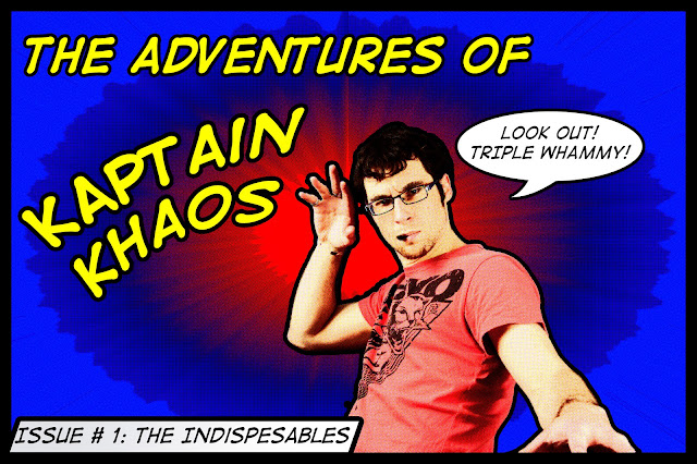
Next I then tried to use text more and combined the cutout and halftone techniques into the one cover. Also as a bit of an in-joke with my people at the pharmacy (they call me Captain Chaos due to my messy desk and nature) I created a cover of myself as "Kaptain Khaos". I used K's because they look better in comic font than C's.


Pharmacy or Med people will get the Triple Whammy reference.

Lastly my wife asked me to do something with our guitar/mic photo that we posted earlier in the year. So I kindly obliged.


I think I can improve on this technique a bit (for instance cutting each person out separately then putting them back together to show the separation and possibly venturing into adding brush lines to the outline of the arms etc. Perhaps I will

Ciao,

Az.

Shooting Musicians


Hey hey peeps,

Have been very busy over the last few weeks so haven't had time to post up.

Firstly:

A couple of weeks ago I was asked to take a few shots of some bands at the Beat the Street Festival. Some of these guys are bands that are still trying to make a name for themselves.

Secondly:

Given a very strong amount of sunlight, I had to pull the shutter down until I got the ambient exposure down to a place where I was happy with it. (I really wanted that frozen in motion look so 1/800th was satisfactory)

Thirdly:

It was going to be one of those "assignments" that you had to change the exposure and white balance.... CONSTANTLY!

So anyway without further ado here were the shots from the daytime portion:

My Echo (A Melbourne band with a sound similar to that of The Living End) were fantastic. They had such energy in their set! I really recommend you check these guys out.


Then came the wonderful talents of Mr Beatbox himself, Joel Turner


Now up to this point I really wasn't happy with some of the shots that I was taking - mostly because I missed a few opportunities to "capture the real moment" or to "capture the energy" - fortunately as the sun began to set I started to capture some good moments.

Next up was Dissonance - A band from Narangba.


Then Joel Turner came out again


 Then I had dinner :) oh yeah then took a couple of Burning Brooklyn - another start up band. They have a real Story of the Year/Taking Back Sunday feel to them.

Earlier in the day:


At night:


...And then Joel Turner came back again (pretty cool guy to talk to though). Now from here on in I used Flash predominately to portray some sort of mood. I am happier with the night time photos because of the extra control that you have over the light.


Now lastly there was the headline act: New empire

Some group shots earlier in the day:


Then the night shots


So in the end I'm sorta happy with the result, but sorta :S with the earlier ones. Oh well, at least  I had a great opportunity to meet some cool people and take their photo.

Azza